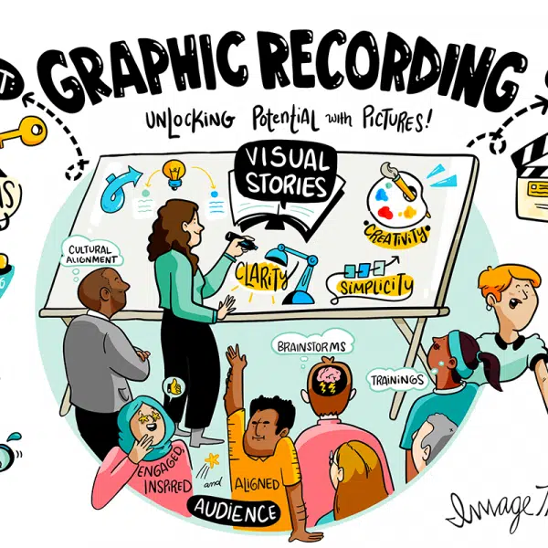
A graphic recording is only as powerful as its ability to be understood. Not just by the people in the room on the day — but by every member of a diverse audience who encounters it afterwards, whether on a screen, in a printed summary, or shared across a global organization.
Visual accessibility is the discipline that makes that possible. It is the set of deliberate choices — about fonts, color contrast, layout, and digital formatting — that determine whether a visual communication tool works for everyone or only for some. In graphic recording, where complex ideas are distilled into hand-crafted visuals at speed, those choices carry real weight.
At ImageThink, we have been building visual accessibility into our practice since 2009. Here is what every organization commissioning or creating graphic recordings needs to understand.
What Is Visual Accessibility, and Why Does It Matter in Graphic Recording?
Visual accessibility means designing images and graphics so that they can be understood by people across a wide range of visual abilities — including those with low vision, color blindness, dyslexia, or other perceptual differences. It also encompasses the needs of people viewing content in challenging conditions: small screens, poor lighting, low-resolution prints.
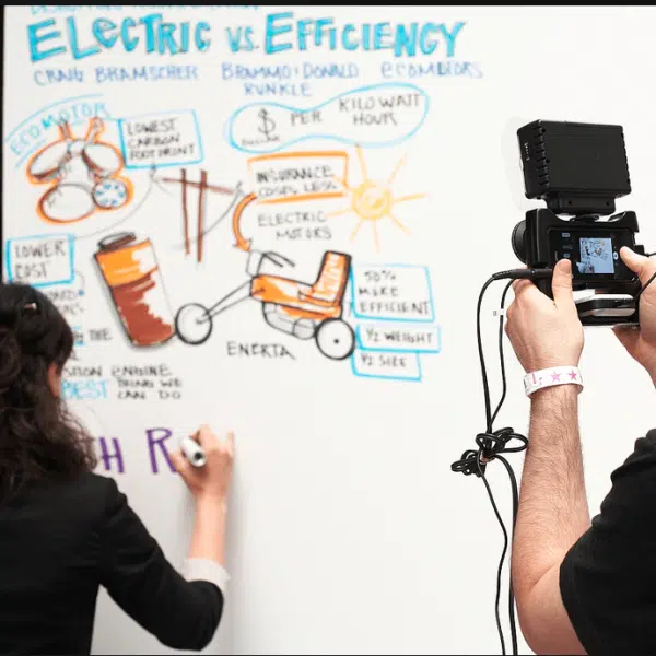
In graphic recording, the stakes are higher than in many other visual formats. A graphic recording is often the definitive record of a high-stakes conversation — a strategic session, a leadership offsite, a conference keynote. If that record is not accessible, the people who cannot read it are excluded from the knowledge it contains. That is not a design problem. It is a communication failure.
Accessible design does not constrain creativity. In our experience, the discipline of accessibility produces clearer, more considered visuals — ones that communicate more effectively for all audiences, not just those with accessibility needs.

Fonts and Color Contrast: The Foundation of Accessible Graphic Recording
Typography is where visual accessibility begins. For graphic recording to be legible across diverse audiences, body text should be a minimum of 14pt for print and 16px for digital outputs. Sans-serif typefaces — Arial, Helvetica, Verdana — offer the most consistent legibility. Decorative scripts, compressed letterforms, and all-caps body text all reduce readability, particularly for users with dyslexia or low vision.
Color contrast is equally critical. The Web Content Accessibility Guidelines (WCAG) recommend a minimum contrast ratio of 4.5:1 between text and background for body copy, and 3:1 for large headings. In practice, this means dark text on light backgrounds, and avoiding combinations — such as red on green, or yellow on white — that are indistinguishable for users with color vision deficiency. Approximately 8 percent of men and 0.5 percent of women experience some form of color blindness. In a room of 100 people, that is a significant portion of your audience.
The comparison below illustrates the difference between accessible and inaccessible choices made in practice.
| Accessible | Inaccessible | |
| Text on background | Black on white (21:1 ratio) | Light gray on white (1.6:1 ratio) |
| Heading color | Dark navy on white (15:1 ratio) | Yellow on white (1.07:1 ratio) |
| Key callout | White text on dark teal (8:1 ratio) | Orange text on red (1.5:1 ratio) |
| Font size (body) | 14pt minimum for print | 8pt or below |
| Font style | Sans-serif, consistent weight | Decorative script, all-caps blocks |
| Color used alone to convey meaning | Never — always paired with label or icon | Red = bad, green = good (no label) |
One principle above all others: never use color as the sole means of conveying meaning. If a section is marked important in red, add a label or icon that communicates the same information without relying on color perception.
How to Write Alt-Text for Graphic Recordings and Complex Visuals
When graphic recordings are shared digitally — as images on a website, in an email, or across internal platforms — alt-text is the mechanism that makes them accessible to screen reader users. Most alt-text written for complex visuals falls short because it describes what an image looks like rather than what it communicates.
Strong alt-text for a graphic recording should capture the structure of the visual, the key themes or ideas presented, and the relationships between them. It should tell the reader what they would understand if they could see the image — not simply confirm that an image exists.
| Type of Visual | Weak Alt-Text | Strong Alt-Text |
| Strategic summary graphic | Image of a whiteboard | Hand-drawn graphic recording of a leadership strategy session showing four priorities arranged in quadrants: Growth, Culture, Innovation, and Efficiency, with connecting themes noted between each. |
| Process flow visual | Diagram | Visual flow diagram showing a five-step change management process: Awareness, Understanding, Commitment, Action, and Reinforcement, with arrows indicating progression and key questions noted at each stage. |
| Data visualization | Chart | Illustrated bar chart comparing employee engagement scores across four departments in 2024. Operations scored highest at 87 percent, followed by Product at 82 percent, Finance at 74 percent, and Sales at 69 percent. |
For particularly complex graphic recordings, consider supplementing alt-text with a longer written description in the body of the document or page. This serves screen reader users and also functions as a useful text summary for any audience member who wants to revisit the content quickly.
Ready for graphic recording that works for everyone?
Graphic Recording Accessibility Checklist
Use this checklist to evaluate any graphic recording output — live, printed, or digital — against core visual accessibility standards.
| ✓ | Graphic Recording Accessibility Checklist |
| ☐ | Body text is a minimum of 14pt for print, 16px for digital |
| ☐ | Sans-serif fonts used throughout (Arial, Helvetica, or similar) |
| ☐ | Text and background color contrast meets a 4.5:1 ratio minimum |
| ☐ | Color is never used as the sole means of conveying meaning |
| ☐ | All sections and data points carry descriptive labels |
| ☐ | Visual hierarchy is communicated through size and weight, not color alone |
| ☐ | Alt-text is written for every digital graphic recording output |
| ☐ | Alt-text describes both content and communicative purpose |
| ☐ | Digital outputs are tested with a screen reader before distribution |
| ☐ | Live graphic recordings are supported by verbal narration where possible |
Accessible Graphic Recording Strengthens Communication for Everyone
There is a common misconception that accessibility standards exist primarily for edge cases — a small percentage of users with specific needs. The evidence points in the opposite direction. Captions benefit people in noisy environments. High contrast benefits anyone reading in bright sunlight. Clear labels and generous white space benefit every audience member processing complex information quickly.
Accessible design is inclusive design, and inclusive design is simply better design. The organizations that build visual accessibility into their graphic recording practice do not just serve a broader audience — they produce sharper, clearer, more effective communication assets across the board. In our experience at ImageThink, accessible graphic recordings generate more engagement, travel further across organizations, and hold their value longer than visuals built without these principles in mind.
ImageThink’s graphic recording and visual facilitation practice is built on the principle that every idea deserves to be seen — by everyone in the room. If you are ready to make your next session more inclusive and more impactful, get in touch.
Frequently Asked Questions About Visual Accessibility in Graphic Recording
What is visual accessibility?
Visual accessibility means designing images, graphics, and visual communication so that they can be understood and used by people with a wide range of visual abilities — including those with low vision, color blindness, or other perceptual differences. In graphic recording, it means making deliberate choices about fonts, contrast, layout, and digital formatting so that every visual output is as inclusive as it is effective.
How do you make graphic recordings accessible?
Start with font size and legibility — sans-serif typefaces at a minimum of 14pt for print. Apply sufficient color contrast between text and background. Never use color alone to convey meaning. Label every section and data point clearly. For digital outputs, write descriptive alt-text that captures both the content and the communicative purpose of the visual.
Why is color contrast important for accessibility?
Approximately 8 percent of men and 0.5 percent of women have some form of color vision deficiency. Insufficient contrast between text and background makes content illegible for these users and for anyone viewing in poor lighting or on a low-quality screen. WCAG guidelines recommend a minimum contrast ratio of 4.5:1 for body text and 3:1 for large headings.
How should alt-text be written for visuals?
Alt-text for graphic recordings should describe both what is shown and what it communicates. A weak description says “image of a whiteboard.” A strong one explains the structure, key themes, and relationships between ideas captured in the visual. For complex graphics, consider a longer description in the body of the document alongside the image.
What fonts are best for accessibility?
Sans-serif fonts — such as Arial, Helvetica, Verdana, and Open Sans — are consistently the most legible for diverse audiences. Avoid decorative scripts, all-caps body text, and fonts with very thin strokes. In graphic recording, consistent letterform and generous spacing matter as much as the typeface itself.