What separates a brand that people remember from one they scroll past? Often, it comes down to a single thing: clarity. Most organizations have a genuinely compelling unique selling proposition (USP) buried somewhere in a deck, a brand document, or a strategy offsite summary. The problem isn’t that the idea isn’t there. It’s that no one can see it.
When you visualize your USP, you give your brand’s most important idea a shape—and that changes everything.
What Does It Mean to Visualize Your USP?
To visualize your USP means to translate your unique selling proposition from abstract language into a clear, visual format that anyone can read and immediately understand. Not a paragraph. Not a slide deck. One page.
It’s the difference between “We deliver innovative, customer-centric solutions” and a single visual that shows exactly who you serve, what problem you solve, why you do it better, and what proof backs that up—at a glance.
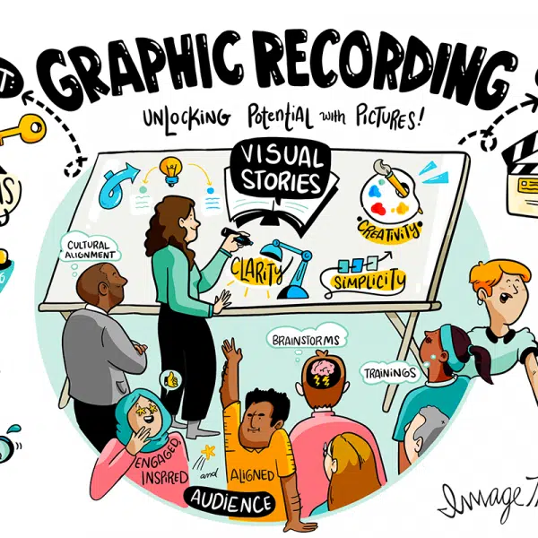
At ImageThink, we’ve spent 17 years helping the world’s leading organizations do exactly this. From Fortune 50 boardrooms to global conferences, we’ve seen firsthand how a single well-structured visual can cut through complexity faster than any written brief.
Why Visualizing Your USP Helps You Stand Out Faster
Here’s the truth: most people are visual learners. Research shows we process and retain images far more effectively than text alone—and we’re three times more likely to share visual content.
Your unique selling proposition deserves that advantage. When you visualize your USP, you stop competing in a sea of words and start communicating in the language your audience is already fluent in.
Speed matters, too. Decision-makers—VPs, CMOs, heads of strategy—don’t have time to read three paragraphs to find your point. One-page messaging forces the discipline that busy audiences require.

How a One-Page Format Clarifies Brand Differentiation
A one-page format isn’t a constraint. It’s a filter.
When you’re forced to fit your entire brand differentiation story onto a single page, you quickly discover what’s essential and what’s noise. The exercise of distilling your value down to one page is itself a clarifying act—for your team, not just your audience.
Think of the page as a visual argument: every element earns its place. The result is one-page messaging that’s easier to share, easier to align around, and easier for clients and partners to repeat back in their own words.
What Should Be Included When You Visualize Your USP?
A strong one-page USP visual typically includes four core components, organized so the eye moves naturally from problem to solution to proof:
1. Your Audience — Who, specifically, are you serving? Name the person, the role, the challenge they face every day.
2. The Problem — What’s the friction, the gap, the thing that keeps them up at night? State it plainly.
3. Your Unique Value — What do you do that no one else does quite the same way? This is your unique selling proposition made visible.
4. Proof Points — What evidence demonstrates your value? Numbers, client names, outcomes. Concrete, not abstract.
When these four elements are visually organized—not just listed—they create a story. And stories stick.
How Visual Storytelling Makes Your USP More Memorable
Picture this: you walk out of a two-hour strategy session. Three weeks later, what do you remember?
If the session produced text-heavy slides, probably very little. If it produced a clear visual map of the key ideas, you remember the shape of the story. The structure. The relationships between ideas.
Visual storytelling works because it engages the whole brain. It creates spatial memory, not just verbal recall. When you visualize your USP through a cohesive one-page narrative—using layout, hierarchy, and visual flow—you give your audience something to hold onto long after the meeting ends.
This is what ImageThink calls “ImageThinking.” It goes far beyond illustration. It’s strategic communication that turns complex brand messaging into something people can actually use.
Why Simplicity Matters When Communicating Unique Value
Complexity is the enemy of differentiation.
The more words you use to explain what makes your brand different, the less certain you sound. Simplicity signals confidence. It signals that you know exactly what you do and why it matters—and that you respect your audience’s time enough to get to the point.
One-page messaging is a discipline. It asks hard questions: What’s truly unique? What does your audience actually care about? What can you prove? What can you cut?
The answers shape a USP that’s not only clear—it’s credible.
Ready to make your unique value impossible to miss?
How To Turn Complex Brand Messaging Into One Clear Page
Start with what you have: brand docs, decks, positioning statements, sales scripts. Now imagine you had to throw most of it away and keep only what your best client would actually say when recommending you to someone else.
That’s your starting point.
From there, use a structured visual framework. Map your audience in one zone, your problem statement in another, your value in the center, and your proof at the bottom. Use visual hierarchy—size, placement, weight—to guide the eye. Let layout do the work that bullet points can’t.
This is where working with a visual thinking partner pays off. At ImageThink, we’ve helped organizations from technology to healthcare to global nonprofits distill years of strategy into one-page visual stories that actually move people.

Visualize Your USP vs. Traditional Brand Messaging Documents
| Traditional Brand Document | One-Page USP Visual |
| 10–40 pages | One page |
| Read once, rarely shared | Shared across teams and client conversations |
| Understood by insiders | Understood by anyone |
| Hard to align around | Natural alignment tool |
| Quickly outdated | Easy to update |
Traditional brand messaging documents have their place. But when it comes to first impressions—with clients, partners, new hires—nothing works faster than a single visual that tells your whole story.
What Layouts Work Best for a One-Page USP Story?
The best layouts guide the eye from tension to resolution. A few that work well:
The Funnel — Start wide with the audience and problem at the top, narrow to your solution, land on proof at the bottom. Creates a natural sense of progression.
The Hub-and-Spoke — Place your core value proposition at the center, radiating out to supporting proof points. Works well when you serve multiple segments with one unifying value.
The Journey Map — Show the before-and-after. On the left, the world without your solution. On the right, the transformed state. Your USP lives in the middle as the bridge.
The right layout depends on your story. What matters most is that the visual has a clear entry point, a logical flow, and an unmistakable center of gravity.
Common Mistakes To Avoid When You Visualize Your USP
Trying to say everything. A one-page USP visual is not a comprehensive brand document. Choose the one thing that makes you different and let it breathe.
Using jargon as a shortcut. Words like “innovative,” “integrated,” and “end-to-end” say nothing. Replace them with specifics.
Skipping the proof. A USP without evidence is just a claim. Anchor your unique value in real outcomes—client names, numbers, transformations.
Designing before thinking. Visual appeal matters, but structure comes first. If the logic isn’t sound, the layout can’t save it.
Forgetting the audience. Visualize your USP from your client’s perspective, not your own. What do they need to understand, quickly?
How To Make Your USP Easier for Teams and Clients To Understand
When your USP lives on one clear visual page, something powerful happens: your whole team can explain it. Not just your CEO. Not just your sales lead. Everyone.
That kind of alignment is rare—and immensely valuable. It means your marketing, sales, and client success teams are all telling the same story. It means a new hire can get up to speed in minutes, not months. It means your clients can repeat your value back to their colleagues without misquoting you.
Ready to visualize your USP in a way that makes your brand impossible to misunderstand? Explore ImageThink’s visual strategy services and see what one page can do.
Ready to Picture Your Big Idea?
"*" indicates required fields