The first 90 days of a new hire’s experience are disproportionately important. How quickly they build a mental model of the organization, understand their role, and connect with the people and processes around them determines how fast they can contribute — and whether they stay. Most organizations still rely on the same onboarding tools they have used for years: dense employee handbooks, slide-heavy orientation sessions, and document folders that no one reads twice. The information is there. The clarity is not. Visual onboarding changes the equation. By translating orientation content into formats the brain processes faster and retains longer, it gives new hires a clearer picture of where they are, what matters, and how to move forward — sooner.
What Is Visual Onboarding?
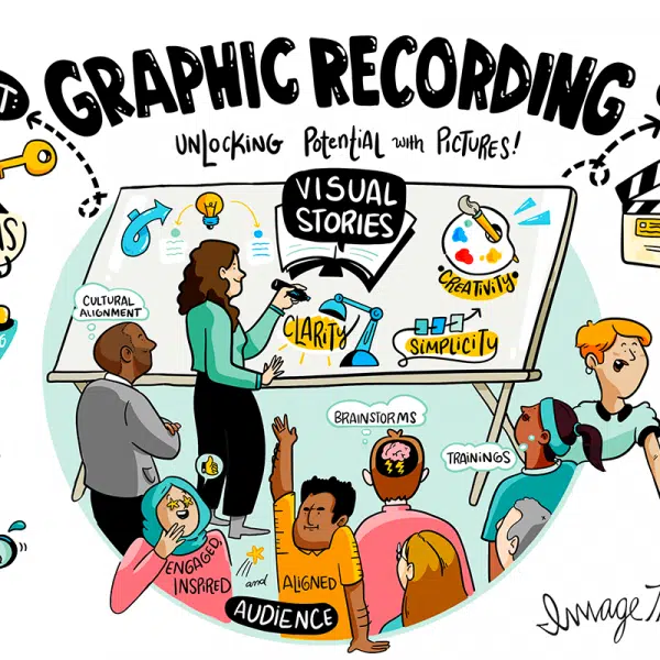
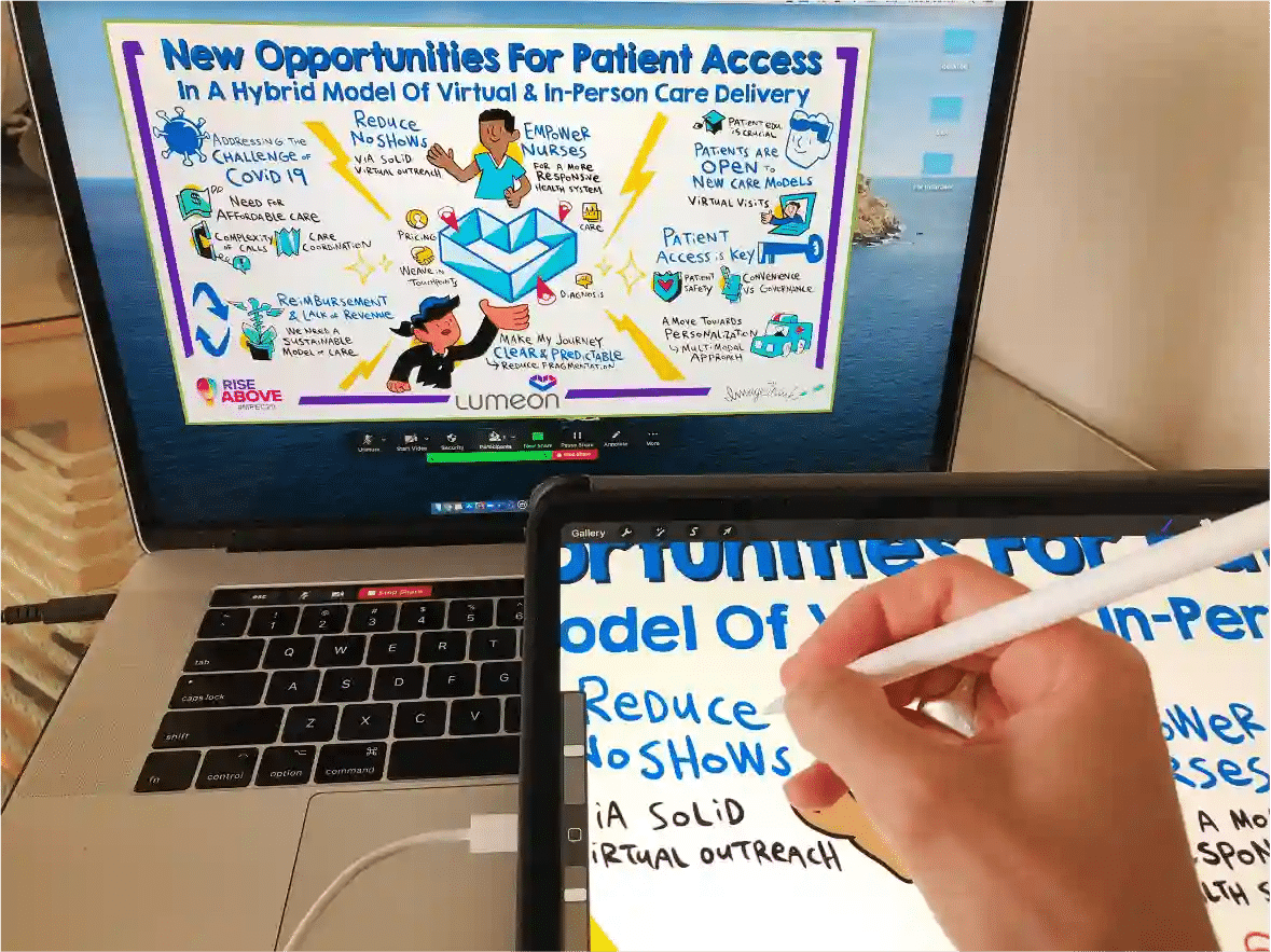
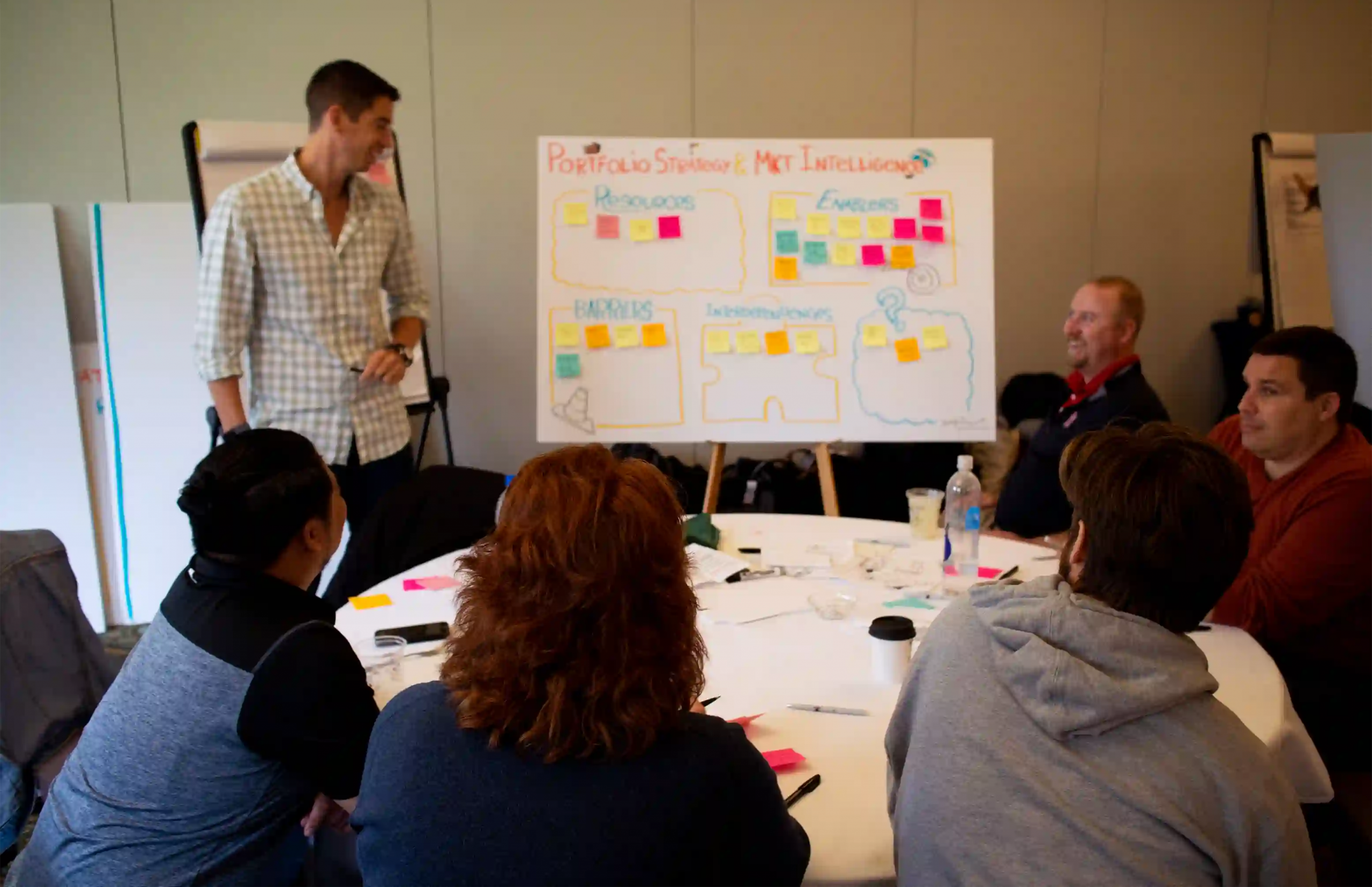
Visual onboarding is the practice of using images, diagrams, process maps, journey maps, and other visual formats to communicate what new hires need to know in order to become productive. Rather than presenting orientation content as walls of text, it translates that content into formats that are faster to absorb, easier to navigate, and more likely to be retained — particularly in the cognitively overloaded first weeks of a new role. The approach draws on the same principles that make graphic recording and visual facilitation effective in strategic sessions: making information visible reduces confusion, accelerates shared understanding, and gives people a reference they can return to independently.
Why Visual Onboarding Reduces Time-to-Value
New-hire time-to-value — the point at which a new employee begins making a meaningful contribution — is directly tied to how quickly they understand three things: how the organization works, where their role fits within it, and what they should focus on first. Traditional new-hire onboarding is slow to deliver clarity on all three. Visual onboarding accelerates each. An illustrated org chart communicates reporting lines and team relationships in seconds. A process map shows exactly how a new hire’s workflow connects to the work of other teams. A visual strategy summary makes the organization’s priorities legible without requiring a new hire to decode a 40-page document. The result is faster employee ramp-up — not because the information is simplified, but because it is structured in a way the brain can actually use.
What Types of Onboarding Content Work Best Visually?
Not all onboarding content benefits equally from visual treatment. The formats that translate best are those where structure, sequence, or relationships between elements carry meaning — where seeing how things connect adds something that text alone cannot convey. The highest-value visual onboarding content types include:
- Org charts and team maps showing reporting lines and cross-functional relationships
- Process flows for the workflows a new hire will use most in their first 30 days
- Visual strategy summaries translating organizational priorities into a single, legible picture
- Role relationship diagrams showing how a new hire’s function connects to other teams
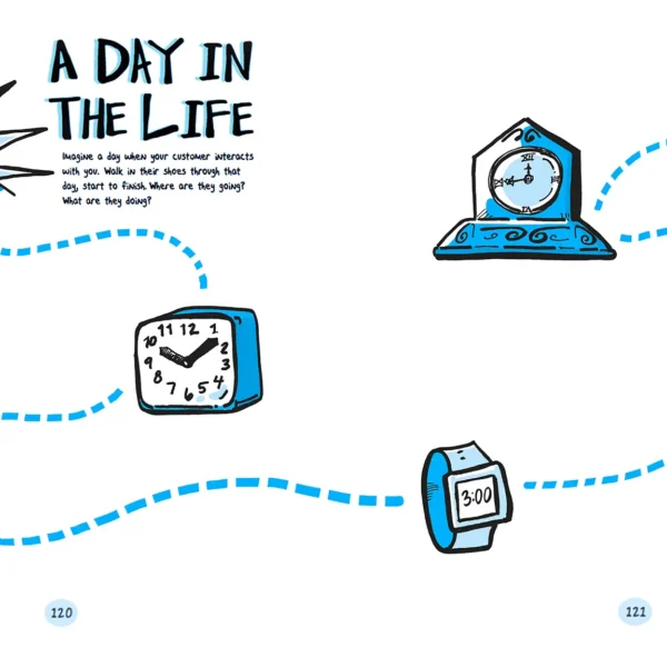
- Customer or stakeholder journey maps giving context for who the organization serves and how
- Onboarding timelines mapping the new hire’s journey from orientation through full productivity
Dense policy documents, legal materials, and highly technical reference content are better suited to traditional formats. The goal is not to illustrate everything — it is to make the structural and relational content that enables independent navigation genuinely easier to absorb.
Help new hires see the path forward faster.
Visual Onboarding vs. Traditional Onboarding Materials
| Visual Onboarding | Traditional Onboarding Materials | |
| Communicates structure at a glance | ✓ | ✗ |
| Reduces information overload | High | Low |
| Supports faster retention | ✓ | Partial |
| Adaptable to different learning styles | ✓ | Partial |
| Useful as a long-term reference | ✓ | Partial |
| Supports cross-functional clarity | High | Low |
| Reduces time-to-value | ✓ | Slower |
The gap between visual and traditional new-hire onboarding is widest in the areas that matter most for early productivity: clarity about structure, retention of complex information, and usefulness as a long-term reference. A new hire who can navigate independently in week three is more valuable than one still seeking clarification in week six.

Visual Onboarding Asset Checklist
Use this checklist to audit your current onboarding communication against the visual formats that consistently support faster employee ramp-up and clearer role orientation.
| ✓ | Visual Onboarding Asset Checklist |
| ☐ | A visual org chart showing team structure and reporting lines |
| ☐ | A process map for the two or three workflows the new hire will use most in their first 30 days |
| ☐ | A visual summary of the organization’s strategy, priorities, and current initiatives |
| ☐ | An illustrated timeline of the onboarding journey: week one, month one, month three |
| ☐ | A one-page visual role map showing how the new hire’s function connects to other teams |
| ☐ | A visual glossary of internal acronyms, tools, and terminology |
| ☐ | A journey map of the customer or stakeholder experience the new hire’s role supports |
Common Mistakes to Avoid in Visual Onboarding
The most common failure mode in visual onboarding is producing visuals that look clear but are not actually useful — either because they are too high-level to guide behavior, or because they are never updated and quickly become inaccurate. A second common mistake is treating this as a design project rather than a communication one. The goal is not aesthetic polish. It is functional clarity.
- Creating visuals that are too abstract to be actionable. An org chart that shows departments but not the people a new hire will actually work with every day does not help them navigate.
- Producing visuals once and never revisiting them. Onboarding content that reflects a structure or strategy from two years ago actively misleads new hires.
- Overwhelming new hires with too many visuals at once. This approach is most effective when content is sequenced — the right visual at the right moment, not everything on day one.
- Substituting visuals for conversation. Onboarding communication still requires human context. Visual materials support that conversation — they do not replace it.
Since 2009, ImageThink has helped organizations translate complex information — strategies, structures, processes, and change initiatives — into visual formats that people actually use. If your onboarding communication needs more clarity and less noise, we can help. Get in touch to find out more.
Frequently Asked Questions About Visual Onboarding
What is visual onboarding?
Visual onboarding is the practice of using images, diagrams, journey maps, process flows, and other visual formats to communicate the information new hires need to become productive. Rather than presenting orientation content as dense written documents or slide decks, visual onboarding translates that content into formats that are faster to absorb, easier to reference, and more likely to be retained.
How does visual onboarding help new hires?
It reduces the cognitive load of the first weeks on the job. New hires are absorbing large volumes of new information simultaneously — team structures, processes, priorities, tools, culture. Visual onboarding organizes that information spatially and sequentially, making it easier to build a mental model of the organization and their place within it.
Why is visual onboarding effective?
Because most people process and retain visual information more effectively than text alone. Research consistently shows that information paired with relevant visuals is retained at significantly higher rates than text-only content. For new hires navigating an unfamiliar environment, that advantage translates directly into faster employee ramp-up and earlier contribution.
What types of content work best in visual onboarding?
Org charts, process maps, role relationship diagrams, onboarding timelines, strategy summaries, customer journey maps, and visual glossaries all translate well. The common thread is content where structure, sequence, or relationships between elements matter — where seeing how things connect adds meaning that text alone cannot convey.
How do you improve new-hire time-to-value?
The fastest path to reducing time-to-value is reducing the time new hires spend confused about how the organization works, where they fit, and what they should focus on first. Visual onboarding addresses all three directly — by making structure visible, clarifying role context, and giving new hires a reference they can return to independently rather than asking repeated questions.