You know that moment when someone asks, “Who should we talk to about this?” and the room goes quiet? Not because no one knows the answer, but because everyone has a different answer—and they’re all right.
That’s because your organization doesn’t actually work the way the org chart says it does.
The org chart shows reporting lines. But the real work? That happens through a web of relationships that no chart can capture. The product manager who always knows which engineer to ask. The customer success rep who can get marketing to move fast when needed. The quiet middle manager who everyone trusts with sensitive questions.
These invisible networks of trust, influence, and collaboration are what actually make your organization work. And relationship mapping is how you make them visible.
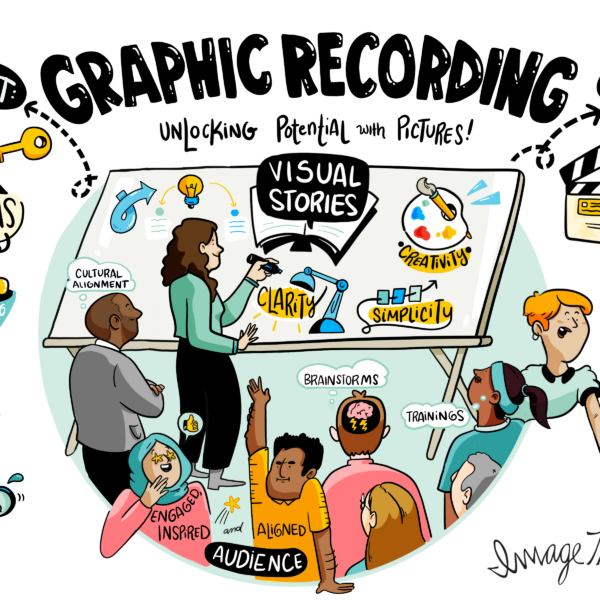
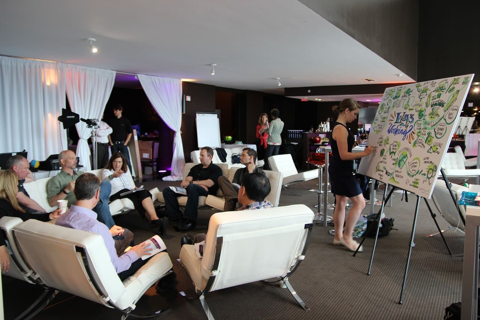
At ImageThink, we’ve visualized these hidden networks in thousands of sessions—from global tech offsites to healthcare transformations and non‑profit coalitions. When leaders finally “see” their real organization, their strategy conversations change.
What Is Relationship Mapping?
Relationship mapping is the practice of visualizing how people actually connect, collaborate, and influence each other in your organization. Unlike org charts that show who reports to whom, relationship maps reveal:
- Who talks to whom (formally and informally)
- Who trusts whom—and who doesn’t
- Who influences decisions, regardless of title
- Where the real channels of communication and collaboration flow
Think of it this way:
- An org chart is like a building’s blueprint—it shows the structure.
- A relationship map is like watching how people actually move through that building—where they gather, which paths they take, which doors they never use.
At its core, relationship mapping answers questions that matter for getting things done:
- Who are the real influencers, regardless of title?
- Where do ideas and decisions actually flow?
- Which teams are truly collaborating, and which are siloed?
- Where are the critical connections—and the dangerous single points of failure?
- Who bridges different parts of the organization?
When you can see these patterns, you can work with them instead of fighting against them.
Quick takeaway for leaders:
Use relationship mapping when you need to:
- Navigate complex stakeholder landscapes
- De‑risk a major initiative or change program
- Strengthen cross‑functional collaboration
- Understand why “on paper” structures aren’t working in practice
Why Relationship Maps Are More Than Lines and Nodes
Here’s what doesn’t work: drawing circles with names and connecting them with straight lines.
Because a line between two people could mean anything. It could mean:
- They have a weekly 1:1 that’s mostly checking boxes
- One mentors the other and changed their entire career trajectory
- They collaborated on last year’s most successful project
- They’re listed as “collaborators” but haven’t actually talked in months
- They’re locked in a passive‑aggressive standoff nobody wants to name
The line doesn’t tell you the story.
Effective relationship mapping goes deeper. It captures:
- Relationship strength
- Is this a strong, trust‑based connection or barely there?
- Do they actively seek each other out, or just end up in the same meetings?
- Direction of influence
- Does information and influence flow both ways, or is it one‑directional?
- Who defers to whom when stakes are high?
- Quality of collaboration
- Generative: creates energy, ideas, and momentum
- Transactional: gets tasks done, nothing more
- Draining: creates friction, rework, and delay
- Type of relationship
- Strategy, daily operations, mentorship, project work, or informal social connection
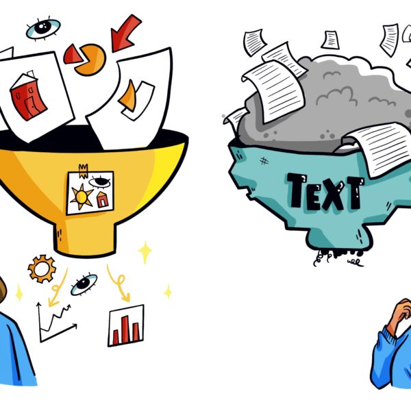
When you map these dimensions visually—with color, thickness, patterns, and spatial arrangement—you move from data to visual storytelling. You create something people can feel, not just understand intellectually.
The Difference Between Connection and Context
Data tells you Person A connects to Persons B, C, and D.
Context tells you Person A is:
- The only bridge between engineering and marketing
- Trusted by Person B after five years of shared wins
- Seen as a strategic thought partner by Person C
- In a brand‑new relationship with Person D that could be game‑changing—if nurtured
Context changes everything.
In stakeholder mapping, knowing that two executives are connected matters less than knowing that one consistently defers to the other on budget decisions. In collaboration mapping, seeing that two teams have a connection point matters less than knowing whether that connection is a bottleneck or a bridge.
This is where visual storytelling becomes essential. When you layer meaning into your maps through intentional visual choices, you create something that tells a story at a glance:
- Color can show relationship health
- Line weight can show strength
- Spatial clustering can show natural teams
- Directional arrows can show influence flow
At ImageThink, we’ve watched teams have “aha” moments when they see their relationships visualized:
- A leadership team realized all decisions were funneling through two people—creating a massive bottleneck.
- A project manager discovered a key stakeholder they’d completely overlooked.
- A team saw how isolated their newest members were and immediately knew what to fix.
Ready to See Your Real Organization, Not Just the Org Chart?
Partner with ImageThink to design custom relationship maps that reveal influence, trust, and collaboration across your teams—and turn those insights into action at your next offsite or strategy session.
Quick takeaway for leaders:
When you review a relationship map, ask:
- Where is the influence concentrated?
- Where are people over‑relied on?
- Who is surprisingly central—or surprisingly isolated?
Turning Static Networks into Dynamic Narratives
The best relationship maps don’t just show you a snapshot. They tell you a story about where you’ve been and where you’re going.
Consider stakeholder mapping for a major initiative. A basic map shows you who’s involved. A narrative‑driven map shows you the journey you need to take:
- Who are your early champions who’ll advocate before you even ask?
- Who are the skeptics you need to bring along thoughtfully?
- Where are the bridge‑builders who can connect different stakeholder groups?
- How does influence need to flow for this initiative to succeed?
- Which relationships need strengthening before you launch?
Visual storytelling techniques make these dynamics visible. For example:
- Use color to show relationship evolution—new connections, established partnerships, relationships that need attention
- Use size to indicate influence or engagement level
- Use visual texture to distinguish between relationship types—strategic partnerships, operational coordination, mentorship, information flow
The map becomes a strategic tool, not just a reference document.
Key Benefits of Relationship Mapping
When done well, relationship mapping drives real impact for time‑poor, outcome‑focused leaders:
- Reveals hidden influencers
Titles show authority. Relationship maps show influence. That senior engineer everyone consults before making technical decisions? They’re a critical node in your influence networks, even if they’re not on the leadership slide. - Identifies collaboration gaps
Collaboration mapping reveals silos you didn’t know existed and cross‑functional work that’s thriving despite—not because of—your structures. - Strengthens stakeholder engagement
Instead of treating stakeholders as a checklist, you understand how they relate to each other, who influences whom, and how buy‑in actually spreads. - Supports change initiatives
Change doesn’t happen through announcements. It happens through relationships. Mapping your influence networks helps you design communication that works with existing patterns, not against them. - Builds team resilience
When you can see your relational infrastructure, you can:- Reduce single points of failure
- Create redundancy in critical connections
- Ensure knowledge and trust aren’t locked in one relationship
- Makes complexity click
Just as strategic visuals make complex strategies understandable, organizational visualization through relationship maps makes your culture and decision‑making patterns visible and actionable.
How to Build Relationship Maps That Tell a Story
Creating effective relationship maps requires both analytical thinking and creative storytelling. Here’s a practical, reuse‑friendly framework you can share with your team:
- Start with purpose, not process
Clarify what this map needs to help you decide. For example:
- Improve cross‑functional collaboration
- Navigate a complex stakeholder landscape
- Identify bottlenecks in decision‑making
- Plan for organizational change
- Gather stories, not just data
In your next strategy session or offsite, ask:- Who do you turn to for strategic thinking?
- Where do you see the strongest collaboration?
- Who bridges different parts of the organization?
- Where do you see trust—and where do you see gaps?
- Make visual choices that convey meaning
Define your visual language before you draw:- Line weight = relationship strength
- Color = relationship quality or type
- Node size = influence or centrality
- Arrows = direction of influence or information flow
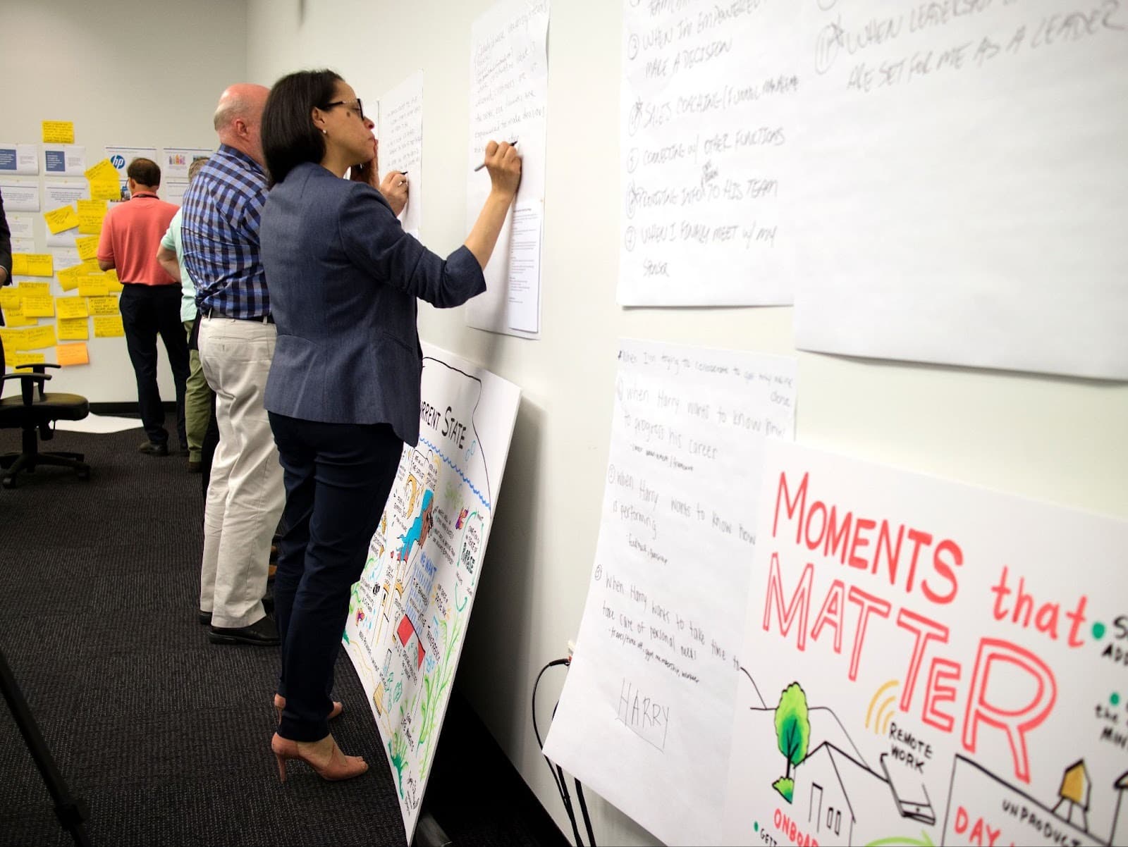
- Build it together
The most powerful mapping happens collaboratively. Use a whiteboard, large paper, or a digital canvas. Let people place themselves, draw connections, and challenge assumptions. The conversation is as valuable as the final map. - Layer information progressively
Don’t show everything at once. Consider:- Version 1: Basic connections
- Version 2: Strength and frequency
- Version 3: Influence flow
- Version 4: Relationship quality
- Ground it in human stories
Connect visuals to real examples:- “This connection helped us pivot our roadmap last quarter.”
- “These isolated nodes explain why onboarding feels rocky.”
Visual Techniques for Effective Relationship Mapping
The visual language you choose either illuminates or obscures your story:
- Use visual hierarchy
Make important elements prominent: key influencers, critical bridges, at‑risk relationships. - Employ color with purpose
For example:- Relationship quality: green (strong), yellow (developing), red (strained)
- Relationship type: blue (strategic), orange (operational), purple (mentorship)
- Team or stakeholder groups: distinct palettes
- Create spatial clustering
Place people and teams that work closely near each other. Gaps and long “bridges” between clusters often reveal collaboration risks. - Show directionality when it matters
Use arrows or gradients to show one‑way vs two‑way influence. This is critical for understanding power dynamics. - Indicate strength visually
Thick, solid lines for strong ties; thin, dashed, or dotted lines for weak, emerging, or strained ties. - Add helpful annotations
Short labels like “key bridge between departments” or “informal decision hub” help executives interpret the map quickly.
Tools and Frameworks for Modern Relationship Mapping
You don’t need a single perfect platform. Many of our clients use a mix:
- For collaborative workshops
- Whiteboards, large paper, sticky notes, markers
- Ideal for leadership offsites and team sessions where the conversation is the goal
- For digital collaboration
- Miro, Mural, Lucidchart
- Great for remote teams iterating on collaboration mapping over time
- For organizational network analysis and data visualization
- Tools like OrgMapper, Polinode, or internal analytics
- Useful for scale, but they still need human interpretation and visual storytelling
- For custom visual storytelling
- Visual facilitation and strategic visuals (what ImageThink is known for)
- Best when you need relationship maps tailored to your culture, language, and leadership questions
Quick takeaway for tool selection:
Choose tools that:
- Allow co‑creation, not just reporting
- Make it easy to layer information
- Support both analysis and storytelling
Real-World Applications of Relationship Mapping
We’ve seen relationship mapping create value across a wide range of scenarios:
- Leadership development
Help emerging leaders understand their influence networks, identify mentors, and build strategic relationships intentionally. - Merger and integration
Map networks in both organizations to identify culture carriers, bridge‑builders, and at‑risk relationships that need support. - Change and transformation
Use stakeholder mapping to understand how ideas will spread, where resistance will form, and which influencers need early engagement. - Innovation projects
Apply collaboration mapping to see which diverse perspectives are connecting—and which valuable voices are isolated. - Sales and business development
Visualize complex stakeholder landscapes in key accounts to navigate political dynamics and sequence engagement. - Team building and culture work
Make visible who’s central, who’s isolated, and where subgroups form—then design interventions to strengthen connection.
In each case, the value isn’t the diagram itself. It’s the insight and alignment the map makes possible.
A Reusable Snippet to Sell This Internally
If you need to explain this to a sponsor, steering committee, or procurement, you can borrow this language:
“We’re not looking for another org chart. We need a relationship map that visualizes influence, trust, and collaboration—not just reporting lines. It will help us see where decisions really get made, where we have bottlenecks and silos, and which relationships we need to strengthen for this initiative to succeed.”
You can drop that into an email, slide, or project brief.
Conclusion: Telling Human Stories Through Relationship Maps
Organizations aren’t org charts. They’re networks of human beings connected by relationships—some strong, some fragile, some generative, some barely there.
When we create relationship maps that honor this reality, we gain:
- A way to see the invisible
- A language to talk about the unspoken
- A tool to make better, more human‑centered decisions
But this only works when our maps tell stories, not just show data. When they capture context, not just connections. When they reveal the texture and quality of relationships, not just their existence.
This is the space ImageThink has worked in for over a decade: using visual thinking, strategic visuals, and live facilitation to help leaders see their organizations clearly—and act with confidence.
The next time you’re facing a challenge that involves people, influence, or collaboration—which is every meaningful challenge—ask:
- What would we see if we mapped the relationships that matter?
- What story would that map tell?
- How could seeing that story help us move forward more effectively?
Because the map is never just lines and nodes. It’s trust and tension, influence and isolation, collaboration and silos, champions and skeptics, bridges and barriers. It’s the hidden architecture of how your organization actually works.
And when you can see that architecture clearly, you can build something better.
If you’re planning a strategy session, leadership offsite, or complex change initiative and want to explore relationship mapping as part of your toolkit, this is exactly the kind of visual work our team at ImageThink loves to support.