Your VP just opened slide 14.
Quarterly sales trends. Seven regions. Three product lines. Four customer segments. All on one chart. She starts: “As you can see here, the numbers show…”
Half the room is already lost.
The chart has everything—data points, trend lines, color coding, annotations. Everything except clarity. Your VP is reading axis labels while executives squint at overlapping lines. Nobody understands what decision this chart is supposed to drive.
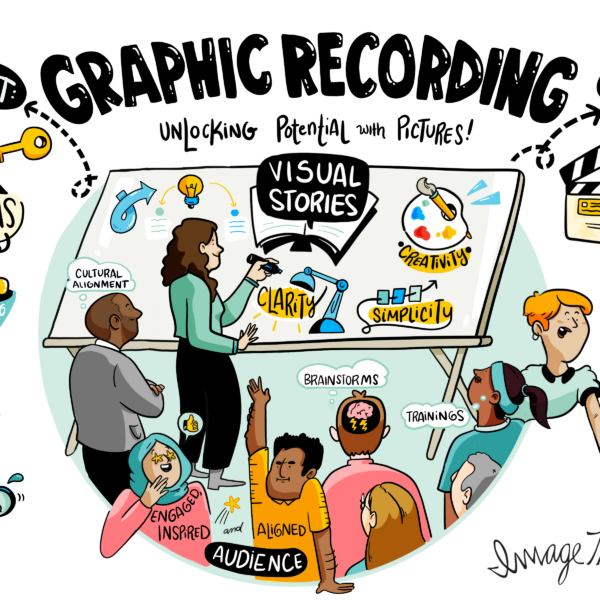
We’ve been pioneering visual communication since 2009. Across thousands of sessions with Fortune 500 companies, we’ve watched presentations succeed and fail. The difference rarely comes down to better data. It comes down to how clearly that data story gets told.
Here’s what changes everything: Speak to the picture. Not around it. To it.
What Is a Chart Talk?
Picture this.
You’re presenting revenue data. Not: “This line represents Q1 revenue and this line shows Q2.” Instead: “Revenue jumped 40% in Q2. Here’s why that matters.”
That’s a chart talk.
The chart does the showing. You do the meaning-making. You’re not describing what’s on the chart. You’re speaking to what the chart means for the people in the room.
It’s strategic storytelling using visuals. You’re making an argument. Revealing a pattern. Driving a decision. The chart provides proof. Your narration provides insight and direction.

Why “Speaking to the Picture” Works
Your brain processes images 60,000 times faster than text.
When you speak to the picture, you focus attention on what matters. A complex chart has dozens of possible stories. When you speak to the specific insight, people know where to look. You’re directing their eyes and their thinking simultaneously.
You create shared understanding fast. Everyone sees the same chart but interprets it differently. Finance sees costs. Operations see capacity. Sales sees opportunity. Speaking to the picture creates one shared interpretation everyone can work from.
You accelerate decisions. Executives don’t decode your chart themselves. They move straight to “what do we do about this?”
Common Mistakes in Chart Talks
Reading the chart aloud kills comprehension. “As you can see, the blue line represents…” Your audience can read. Tell them what the pattern means for their business.
Showing everything proves you did thorough analysis. It doesn’t help anyone make a decision. Show less. Say more about what you do show.
Using the wrong chart type makes speaking to the picture impossible. Pie charts for trends over time. Line graphs for comparisons. 3D charts that distort proportions. The wrong visual means the picture is lying.
A technology client once presented their product roadmap using a Gantt chart with 80 initiatives across 18 months. We asked what decision they needed. “Which five initiatives to prioritize for Q1.”
The chart couldn’t answer that question. We helped them create a simple priority matrix instead. Four quadrants. Twenty initiatives plotted by impact and effort. The chart talk focused on the top-right quadrant.
Decision made in fifteen minutes.
Make complex discussions visible in real time.
How to Craft a Chart Talk That Lands
Start with the decision you need. Before creating any chart, know what action this visual should drive. One chart, one message. If you have three insights, you need three charts.
Write your chart talk first. What do you want to say? Write it as if the chart didn’t exist yet. “Our conversion rate dropped 15% when we changed the pricing page.” Now create the chart that proves that statement.
Make the insight obvious in the visual itself. Use color to highlight what matters. Add a simple annotation. Draw a circle around the critical data point. Your chart should look like your verbal insight sounds.
Test it on someone who doesn’t know your data. Show them the chart for ten seconds. What did they take away? If it’s not your key insight, redesign.
In our experience supporting executive presentations across technology, healthcare, pharma, education, and nonprofits, the most effective presenters treat their chart talk like a guided tour. Here’s where we are. Here’s what changed. Here’s why it matters. Here’s what we’re recommending.

Visual Techniques That Strengthen Your Chart Talk
Use contrast deliberately. Make your key data point a different color. Gray out everything else. Your audience should see the insight before you start speaking.
Add strategic annotations that do the math for people. A simple arrow and “40% increase” tells the story faster than making people calculate it themselves.
Show change over time with brutal simplicity. Before and after. Last year versus this year. Two data points often communicate more than twelve.
Remove chart junk ruthlessly. Every grid line, label, and decorative element that doesn’t support your insight is cognitive load. Strip it out.
Clarity wins. Complexity stalls.
The Role of Storytelling in Chart Talks
Data doesn’t persuade. Stories do.
Your chart provides evidence. Your storytelling provides meaning. Every chart talk needs these story elements: Setup (what’s the context), Conflict (what shifted), Resolution (what happened), Implication (what should we do now).
“We’ve been losing market share in the northeast region for three quarters. Then we launched our new partnership strategy in Q4. Here’s what changed.” Point to the chart showing the reversal. “This pattern suggests we should expand partnerships to three more regions.”
We’ve visualized ideas for world leaders and Fortune 500 executives across four continents. The presentations that drive action always follow this pattern: story first, data as evidence, decision as outcome.
The chart doesn’t tell the story. You do, using the chart as your proof.
Best Chart Types for Clear Communication
Bar charts for comparisons work every time. Comparing this year to last year? Five products? Three regions? Bars work.
Line graphs for trends do one job well. Anything changing over time. Keep lines to three or fewer. More than that becomes spaghetti nobody can follow.
Scatter plots reveal relationships other charts hide. Does price correlate with satisfaction? Plot it. Add a trend line if it clarifies.
Avoid 3D charts entirely. They look sophisticated. They distort proportions and make comparison harder. Two dimensions communicate better than three. Always.
Tables are for precision, not presentation. Use them for reference data, not storytelling.
Tips for Delivering Confident Chart Talks
Point as you speak. Your finger or cursor should land on the exact element you’re discussing. Don’t wave vaguely. Point specifically.
Pause after showing the chart. Give people three seconds to see the visual before you start interpreting. Silence is powerful.
Use plain language that lands hard. “Revenue increased significantly” beats “we observed a statistically significant positive inflection in top-line performance.”
Tell them where to look explicitly. “Focus on this green bar” gives permission to ignore everything else temporarily.
Connect to their priorities specifically. CFOs care about margin. Product teams care about adoption. Operations cares about efficiency. Speak their language, not yours.
End with action, never with trailing off. Your final chart talk should point to a decision or next step. Close with “therefore, we recommend…”
Our team has trained executives and teams worldwide in visual communication. The most confident presenters rehearse their chart talks multiple times. They know exactly what they’ll say and where they’ll point.
That preparation reads as confidence and clarity.

When You Speak to the Picture, Your Message Sticks
Your next presentation doesn’t need more charts. It needs clearer chart talks that guide people to the insights that matter.
When you speak to the picture instead of around it, everything changes. People understand faster. Decisions happen quicker. Your expertise translates into action instead of getting lost in data overload.
At ImageThink, we’ve been pioneering visual communication since 2009. Having worked with 30 percent of Fortune 50 companies across 15 countries, we know what makes visual communication work.
Chart talks aren’t about impressive data visualization. They’re about making your message so clear that people remember it, believe it, and act on it.
Frequently Asked Questions About Chart Talks
What is a chart talk?
A chart talk guides your audience to the insight that matters. You speak to what the chart means, not what’s on it. The chart provides evidence. You provide interpretation and action.
How do you present charts effectively?
Lead with your key insight. Make it visually obvious through color or annotation. Point to specific elements as you speak. Pause three seconds before interpreting. End with a clear recommendation.
How can I make data presentations more engaging?
Tell a story with your data—setup, conflict, resolution, implication. Use plain language. Remove visual clutter. Show simple before-versus-after comparisons. Connect insights to audience priorities.
What makes a chart talk compelling?
One clear message per chart. Visual design that shows the insight immediately. Concrete language about what matters. Specific recommendations. No apologies for simplifying—simplicity is strategic.
How do visuals improve communication?
Your brain processes images 60,000 times faster than text. Visuals create instant shared understanding. They focus attention and make patterns obvious. They eliminate interpretation gaps and accelerate decisions.